UNITED NATIONS GLOBAL COMPACT
United Nations Global Compact, 2020
— UX Case Study —
United Nations Global Compact, 2020
— UX Case Study —
Through developing the program with member companies like Accenture and United Nations partners like UNICEF, the team knew the program would meet real user needs, but only if users engaged with the material. When they used a first draft PDF of the toolkit to get feedback, they learned that the target users found the content overwhelming and difficult to navigate. Since the team’s expertise was in composing the content, they needed help with formatting and structuring it to gain traction with their audience.
The UNGC enlisted Avenir Interactive and I as consultants to help them get the project across the finish line. I led the design and Avenir led the development of a branded multilingual website with a CMS and custom interface built to act as a real learning facilitator by showcasing the toolkit content in an engaging and dynamic way.
The audience for the toolkit includes:
Procurement and corporate responsibility professionals to engage with their suppliers around the topic of decent work.
Sustainability and CSR teams to engage with procurement teams in improving working conditions in global supply chains.
Suppliers to better understand expectations from buyers related to decent work and help them in their communication with buyers when discussing the impact of buying decisions on decent working conditions.
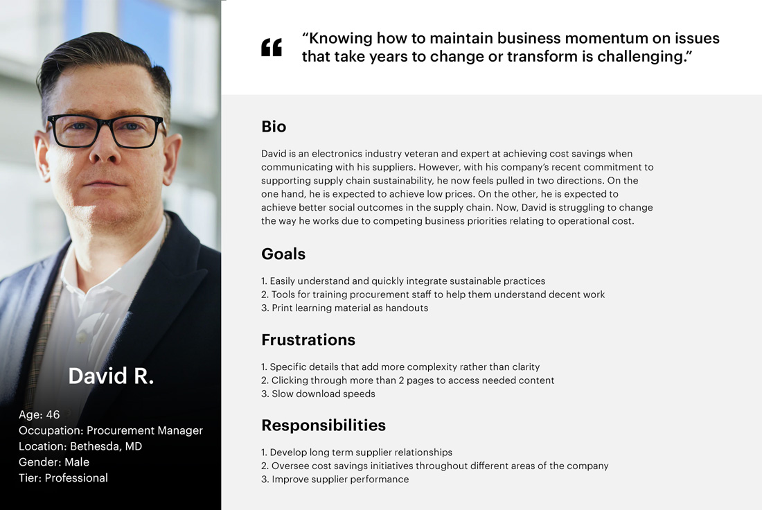
Although the information in the toolkit could be widely applied to any corporate professional involved in purchasing decisions, the language is specifically directed at procurement professionals. So, of these groups, procurement professionals were considered the target user for the project, and a procurement manager was defined as the learner persona.
A project with a digital solution was new territory for the majority of the UNGC programs team. With various backgrounds such as law, anthropology, and economics, the team had extensive knowledge within the realm of the problem space but outside the realm of product design and development, which was an important consideration in handling communication throughout the project.
The deadline for the public launch of the toolkit was six weeks, and the resources we had were more or less fixed by a flat fee. As a result, the ideal would have been to clearly define a fixed scope for the project with detailed requirements upfront. However, we weren’t able to use the content as a guidepost for the product’s features and functionalities because the content was still in draft form.
Given the constraints of fixed time and resources, we defined high-level requirements to provide flexibility for the scope. We knew we needed to be prepared to clearly communicate why some requests might be out of scope without the ability to reference requirements written in stone. But for this project, we also needed to prepare for unavoidable changes since “copywriting is interface design” and edits to the finalized content could broaden the scope at any point.
As consultants joining a project already underway, we started the project off by gathering the stakeholders together to get the lay of the land through asking key questions prepared in advance. After sharing an overview of our plan for the project and management strategy, I began asking background questions to understand the business case for the project and its objectives.
Next, I asked questions aimed at understanding the target user. Since a few members of the UNGC team were subject matter experts and provided extensive research about the users, I was able to collect actionable insights into the user’s context and needs, which provided the basis of the learner persona.
I created the above learner persona through taking what I learned from the stakeholders and filling in the gaps with secondary research like industry reports. As shown, the learner persona of the target user is a corporate level 46-year-old white male with a bachelor’s degree in business. Keeping this persona in mind helped guide many design decisions like keeping the tone very business friendly and using strategic white space to focus on the content.
At this point, I needed to begin establishing a link between the users and the interface. I wrote user stories to get a clear idea of the minimum requirements and how feature requests corresponded to user benefits. My approach was to write the stories as general motivations or requirements to address the high-level problem and categorize them under different epics, which were accessibility, discoverability, and learnability.
Below are a few example user stories pulled from the list of must-have design requirements:
As a procurement professional visiting the website for the first time, I can see an introduction to the website so that it's clear what the toolkit is and how it can help me in my job.
As a procurement professional, I can use the website in my preferred language so that I can effectively utilize the toolkit.
As a procurement professional, I am encouraged to explore other sections of the toolkit, additional resources, and case studies once I've finished reading a page so that I have a seamless learning experience.
A key takeaway from this exercise was the importance of designing for two navigation models where some users would move through the learning material in a linear fashion while others would access specific learning material whenever the need would arise.
Moodboards
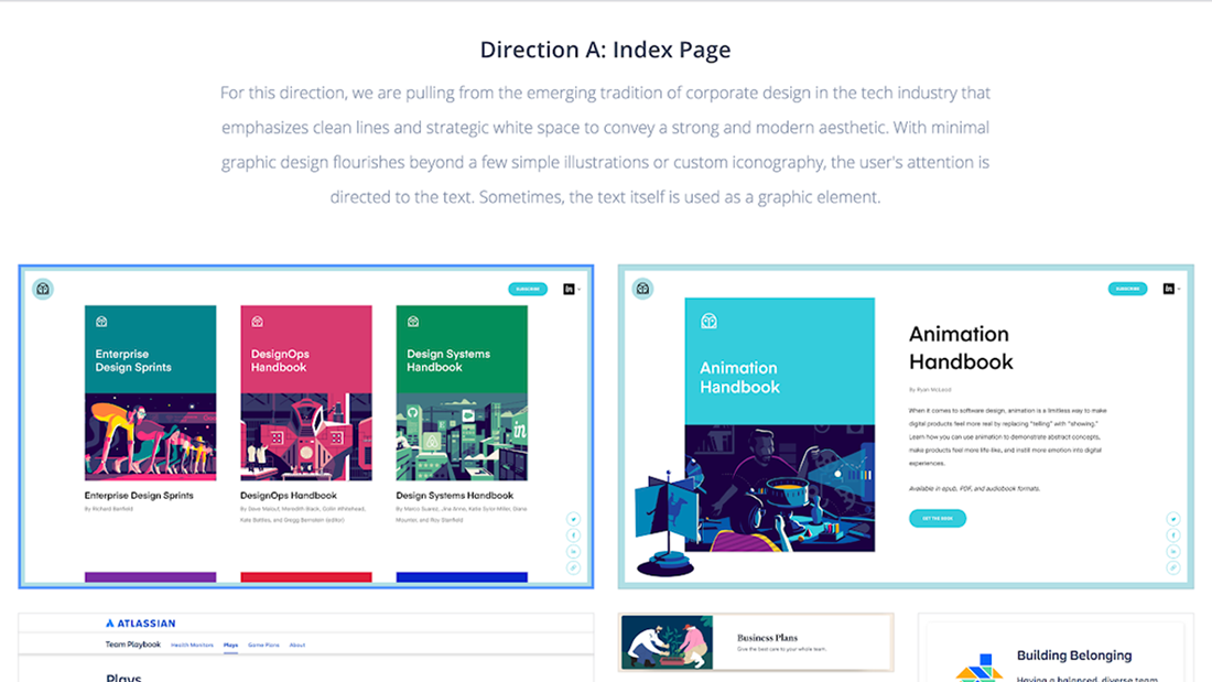
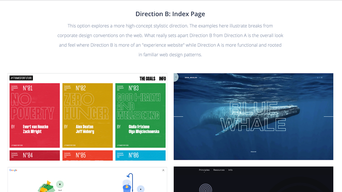
I delivered these moodboards one week after the design discovery meeting. The goal here was to get some general alignment on high level gestures for the visual design so that I’d be able to move into the creation of a few custom design directions that would build on these visual ideas.
The moodboards were divided into two general visual directions/themes of exploration with Direction A being "high polish" and Direction B being "high concept." High polish emphasized clean lines and strategic whitespace, and high concept emphasized breaks from conventional design patterns.
But for both directions, given the context of instructional design for an older, highly educated demographic, I wanted the experience to feel familiar like a textbook, so that was my guiding principle when selecting design patterns.
Mockups in Balsamiq
Concurrently with the visual work, I worked with the client to define an outline of the content showing how the content was generally organized. The intention was to answer questions like:
How many section headings will we need?
How many levels of headings?
What kinds of content objects?
Answering these questions early on helped me stay on top of the similarities and differences between the different sections in the draft content and determine how complex the site would ultimately be to cover our bases with the design. It also gave the client an opportunity to confirm we were on the right track.
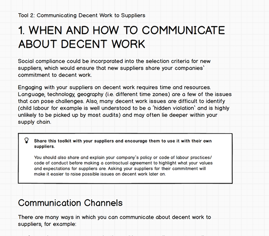
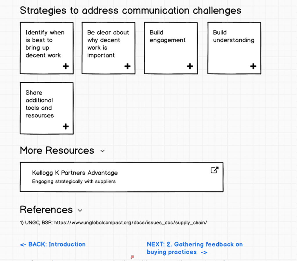
For this, I took a low fidelity approach using Balsamiq to put the focus on the text and think more about the experience rather than the appearance. This was an important step toward making sure that there would be a clear hierarchy for users to efficiently find and navigate to what they need. It also helped me focus on what was being communicated and how it might be communicated more effectively through some copyediting with common UI components in mind.
Site flow
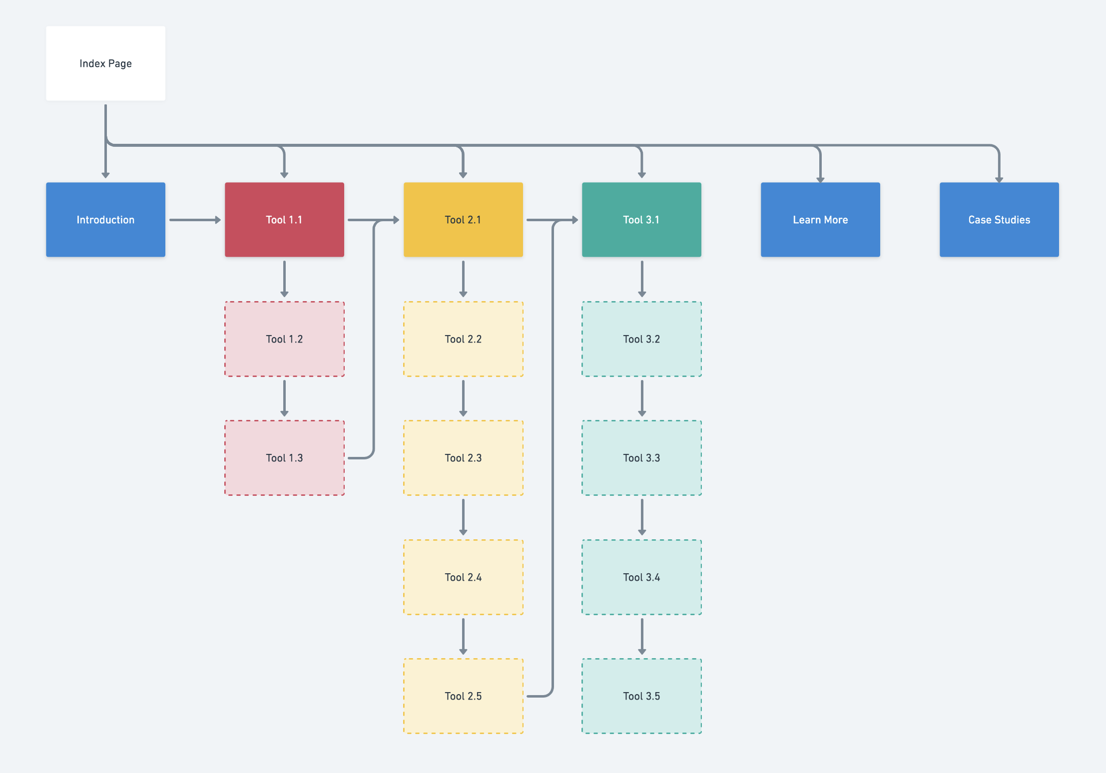
With the hierarchy smoothed out, I put together a site flow to get an idea of how people would move through the website. I needed to visualize how users could either take a linear route through each tool or take a more direct path to access specific content. For example, people who are directed to the site for training might only work through it from beginning to end in a few sittings.
What you don’t see for this stage is all the previous iterations of the site flow, which went through many changes as the draft content shifted around. The final flow broke up the learning material to make each page shorter without losing each tool's depth.
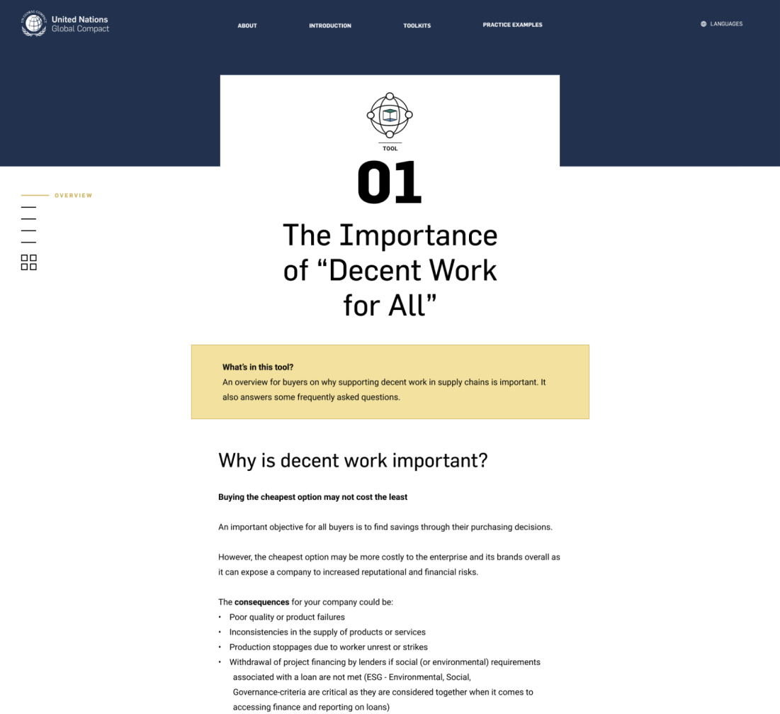
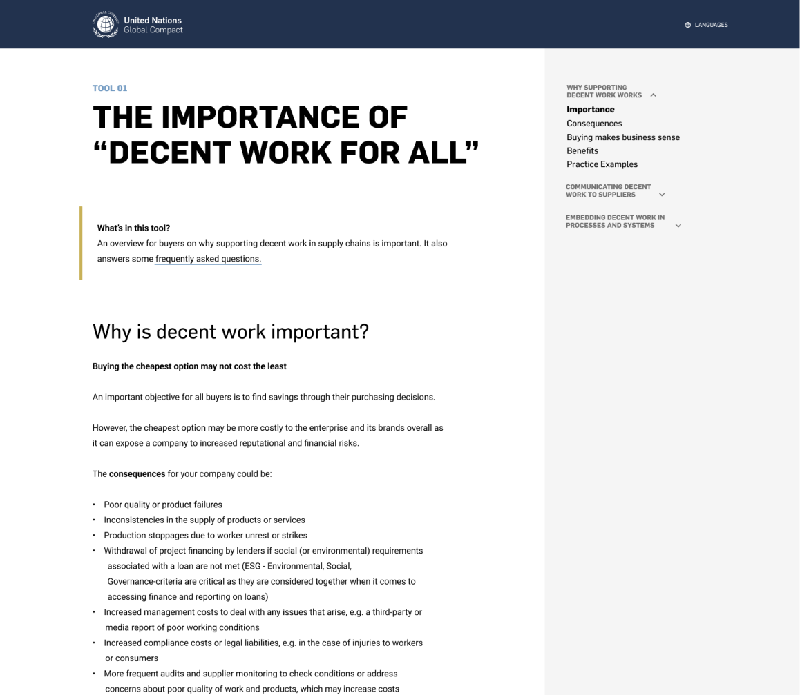
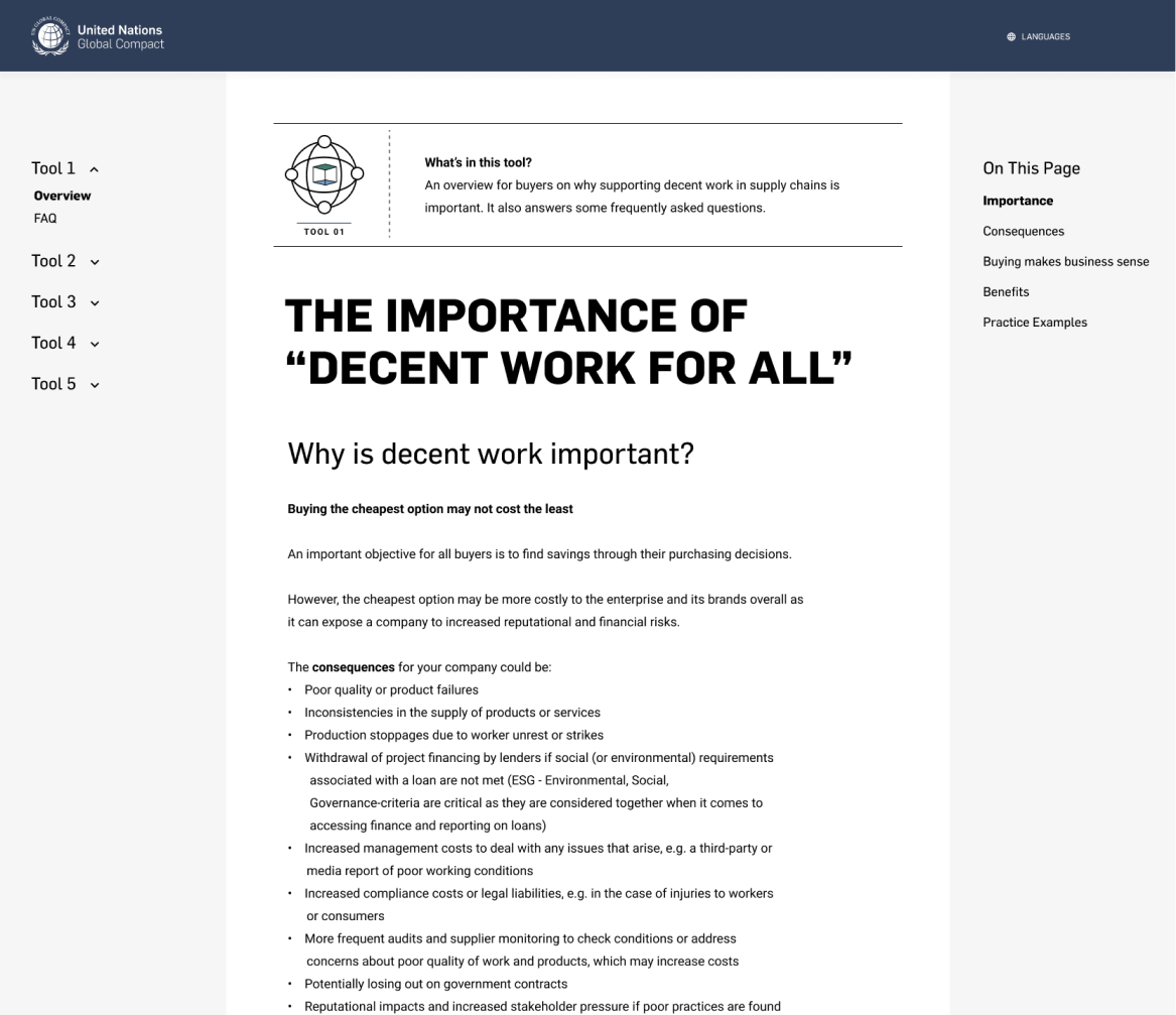
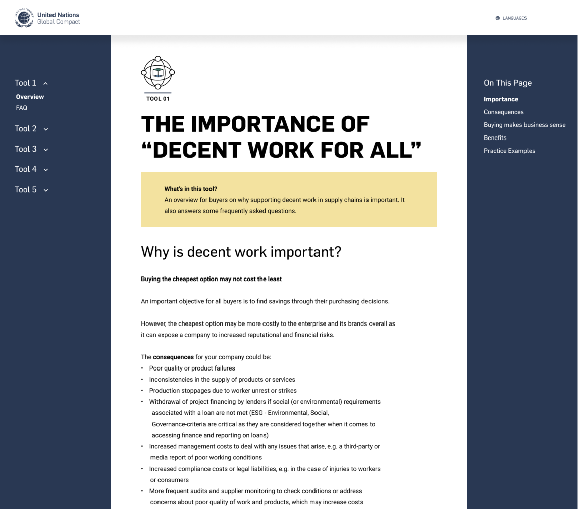
In between working on how the site content would be organized, I reflected on the client's feedback from the moodboard exercise and created various mid-fidelity mockups to explore some layout options.
This level of fidelity for the layouts allowed me to visualize how the pages could look with the visual gestures established by the moodboards combined with the design language established by the client’s brand guidelines. I normally wouldn't have shared these mockups with the client as early as I did since more realized designs can sidetrack design review discussions, but with content still being finalized, I chose to share them to give the client ideas for how they could rewrite the learning material to be more dynamic for web.
After gaining support around one of the above layouts, I began working to address concerns about the functionality and extensibility of the website as it related to the draft content. I needed to show some more examples on how we could best utilize the design components to make the toolkit content more engaging. With a template for the layout approved, designing additional interaction models to support the finalized content was quick work.
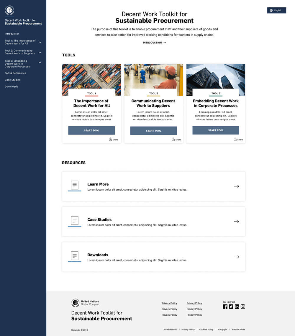
In the final design review, our conversation moved toward discussing more nuanced design issues like how to display footnotes versus comments. Recognizing this, we clarified that I was not designing a 1:1 mockup for every single possible page in the design refinement stage, but rather, finding a "good enough" stopping point where we would all be happy with the look and feel and confident that it could support the evolving content needs. Once the client understood and approved the designs, I handed the below prototypes off to the developers for staging.
Index Page
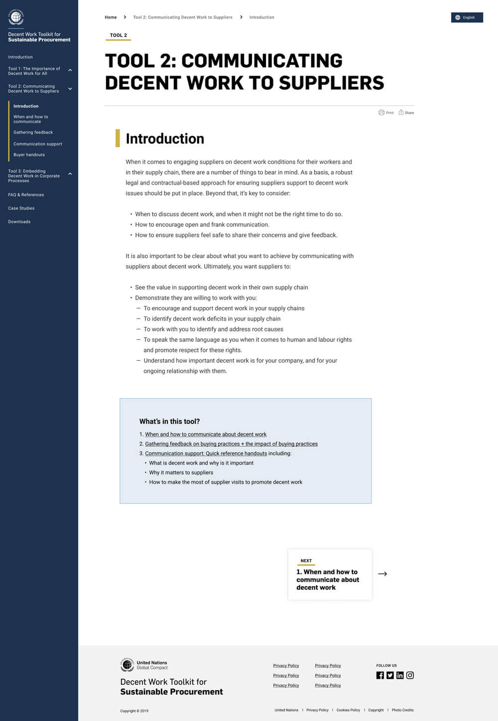
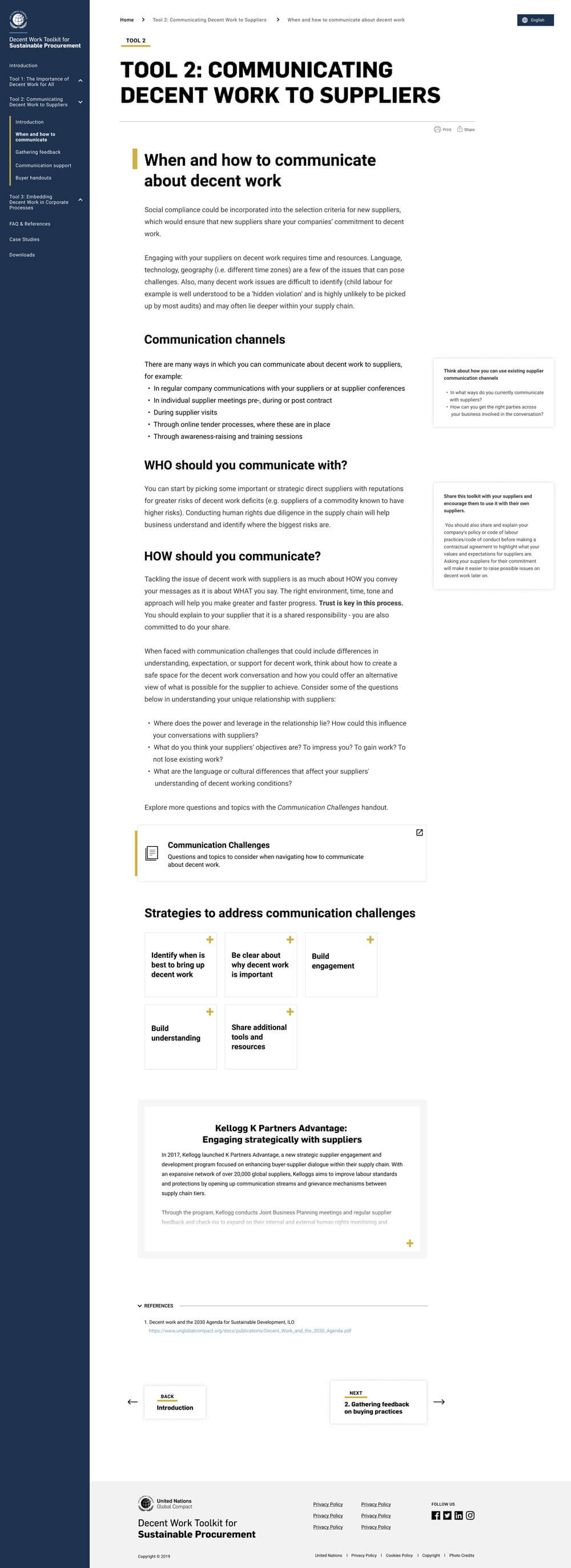
Content Page
Content Page
According to results collected by the client’s research team, the toolkit received a very positive reception. We learned that the design made it easy for procurement managers to see where they are in the learning process and know what to do next, and they felt it was an effective way to learn how to integrate sustainable practices in their day-to-day work. Also, I was happy to hear that these designs have laid the foundation for all of the UNGCs digital products moving forward and have been frequently referenced internally as the ideal.
Lastly, from an agency perspective, I was contracted to work on another project, which is always a good success indicator for consulting engagements. In hindsight, the key to this project's success was being able to quickly create and gain support around a design that was informed by the stakeholders, brand, and the user.